My GIS Portfolio!
Welcome to my digital portfolio! On my home page, you will find a lovely picture of myself, my name in bold, contact information, and links to my LinkedIn and Blogger accounts. A little further down, and you will find a short and sweet bio about my current status and aspirations. Afterwards, there are several sections set up to resemble a resume. All my educational experience is listed in chronological order, as well as my relevant experience to the GIS field. Next I have a few of my main skills listed that I acquired over time in the program. Last, I have a few various samples of projects I have completed over the course of this program. You will find them in the gallery, titled, with a link to each project blog.
Creating this portfolio was a blast, if not confusing and difficult at times. There is so much meticulous work behind every section, that hours could easily be spent behind each one. I really like this kind of format over using LinkedIn, which doesn't really give a person much creative room to express them self.
Friday, December 2, 2016
Final Project - Chaco Canyon: A Site Prediction Model
For my final project, I chose to create a predictive model for Chaco Canyon, located in the San Juan Basin of northwestern New Mexico. This region is characterized by its extensive Puebloan ruins and large Chaco Great Houses. The purpose of this study was to create
a predictive model for potential site locations based off generated secondary
surfaces from a Digital Elevation Model (DEM) of the study area. These
secondary surfaces would then be used as input towards a Weighted Overlay model
and an Ordinary Least Squares (OLS) linear regression analysis. These methods are
intended to aid in identifying trends, relationships between variables, and
possible missing variables for the current predictive model and perhaps future
ones.
All
analysis was conducted using Esri’s ArcMap program. Data used for the study was
gathered from various USGS data download websites and consisted of a DEM, an aerial
imagery raster, and a hydrography shapefile. A polygon boundary for the study
area and point shapefiles for known site locations were created in ArcCatalog to
be used in the study.
The DEM, aerial raster, and hydrography data were all clipped to the study area
boundary to reduce tool process time and produce results relevant to the study.


Slope
was calculated first from the DEM using the Slope (Spatial Analyst) tool. In
the Symbology tab of the slope raster’s Properties, the color scheme was set to
display the Slope scheme for better visual understanding. Next, the slope
raster’s categories were transformed into more meaningful divisions through the
Classify button in the Symbology tab. The Classification was set to the Method
of Defined Interval, with an Interval Size of 12. After symbolizing the slope raster
appropriately, it was then reclassified using the Reclassify (Spatial Analyst) tool.
In the dialog box that appears for the tool, the Old Values reflect the
category changes I made previously for the raster and are left as is, since
they represent the range of slope breaks for the data. Meanwhile, the New
Values were changed to give a higher weight to the most desirable slope for
habitation.The
values were inversely weighted as follows: 3 = 0-12⁰, 2 = 13-24⁰, 1 = 25-36⁰,
and 1 = 37-48⁰.

The next secondary surface to be calculated from the DEM was aspect, which was created using the Aspect (Spatial Analyst) tool. The output aspect raster was also re-symbolized by setting its color scheme to the Aspect scheme in the Symbology tab of its Properties. Next, the Reclassify (Spatial Analyst) tool was used to reclassify the aspect raster into appropriate categories . The Old Values column for this raster display the numbers 0-360 divided into 11-12 categories, which represent the numeric directional facing of the compass. In the New Values column, this was simplified by breaking down the directional facing into three categories, with a higher weight assigned to the most desirable directional facing. The values were inversely weighted as follows: 1 = north, 2 = east/west, and 3 = south.

This area is relatively consistent in terms of elevation, there only being a maximum distance of 300 meters between the highest (~2100m) and lowest elevations (~1800m). In the Classification dialog box of the DEM, the Classification Method was set to Manual, and the Break Values were set at 100 meters apart, creating three categories. The DEM was then ready to be reclassified with the Reclassify (Spatial Analyst) tool . The New Values were then inversely weighted, with the most desirable elevation assigned with a higher weight. The values are as follows: 1 = 2000-2100 meters, 2 = 1900-2000 meters, 3 = 1800-1900 meters.

The last secondary surface to be calculated was hydrography. A 200-meter buffer was created around the streams of the clipped hydrography shapefile in preparation to be converted into a secondary surface. The previously created stream buffer of 200-meters was then converted into a raster using the Feature to Raster tool. The hydrography raster was then reclassified with the Reclassify (Spatial Analyst) tool in order to give the no data value (leftover area with no hydrography data) a new value that would be meaningful for the study . Those values are as follows: 3 = streams, 1 = no data.

Finally, all four of these secondary surfaces were ran through the Weighted Overlay tool in order to create a basic predictive model for potential site locations. In the weighted overlay tool dialog box, the weight of each variable was set to be calculated at: Aspect (40%), Elevation (30%), Hydrography (20%), and Slope (10%) .

With all known sites accounted for, non-sites were needed in order to conduct the additional predictive model. Non-site data was generated using the Create Random Points tool. A sum of 150 points, with a spacing of 30 meters between all points, was created to compare the sites against. The random points were then merged with known points with the Merge tool and labeled OLS points .

Finally, the Ordinary Least Squares (OLS) (Spatial Statistics) tool was conducted on the OLS points . In the tool dialog box, the Unique ID field was set to the previously calculated ID field. The dependent variables were set to the secondary surfaces slope, elevation, aspect, and hydrography.

Lastly, the Hotspot Analysis (Getis-OrdGi) (Spatial Statistics) tool was ran to determine if there were any cold (under-predicted) or hot spots (over-predicted) in the data .

Thursday, November 10, 2016
Biscayne Shipwrecks - Analyze Week
In this week's lab, analysis was conducted on the benthic and bathymetric data from last week. Buffers and clipping was used to determine what type of benthic features could be found within 300 meters of the Heritage Trail shipwreck sites. The benthic and bathymetric data was further analyzed through reclassification in order to determine areas that could be potentially dangerous for ships to travel through. Finally, this reclassified data was ran through a weighted overlay analysis, combining both inputs together to create an output that displays potential areas for shipwreck locations.
300 meter buffer displaying benthic features around each site

Reclassified data

Weighted Overlay Model output

Tuesday, November 8, 2016
Supervised Classification
In this lab, a supervised classification of current land use in Germantown, Maryland was conducted using ERDAS Imagine. AOI signatures were selected by hand using the polygon tool and recorded in the Signature Editor dialog box. All signatures were analyzed through the Mean Plot tool to determine which bands provided the greatest difference between signatures. The bands 3, 4, and 5 provided the greatest difference in signatures and was set as the band combination to reflect the data best. The signatures were then run through the Supervised Classification tool, with an additional Distance File output to show if any signature features are likely to have the wrong classification (symbolized as bright spots). The Distance File is used as a reference for correcting any wrongly classified signatures. Lastly, the supervised image is recoded by consolidating the signatures to eight classes. Those classes are agriculture, deciduous forest, fallow field, grasses, mixed forest, roads, urban/residential, and water. The final output map was created through ArcMap.

Thursday, November 3, 2016
Modeling Biscayne Shipwrecks - Prepare Week
This week, we gathered data on shipwrecks in the Biscayne National Park. This data will be used to generate a weighted overlay model. Data gathered includes a historical nautical chart from 1892, a current ENC, and bathymetric data for the Biscayne Bay. The historical chart was downloaded from the NOAA's Historical Map and Chart Collection and georeferenced to the location. The bathymetric data was downloaded from the NOAA's National Geophysical Data Center and symbolized to reflect depth in meters (shallow in red, deep in blue).

Tuesday, November 1, 2016
Unsupervised Classification
In this lab, an unsupervised classification was performed on an aerial image of the UWF campus, in ERDAS Imagine, using the Unsupervised Classification tool in the Raster tab. Afterward, the results of the unsupervised classification was further reclassified by condensing the original output of fifty color categories into just five color categories. These five categories are grass, trees, shadows, roads/buildings, and mixed surfaces. Mixed surfaces is classified as pixels that can be found across multiple surface types and can not be pinpointed to just one category.
The total area of the campus is 232.26 hectares. Of that total, 142.735 ha (61%) was classified as permeable while 89.5237 ha (39%) was classified as impermeable. Permeable surfaces consisted of the categories grass, trees, and shadows. While some shadows covered impermeable surfaces, the majority covered permeable surfaces. Impermeable surfaces consisted of roads/buildings and mixed. While some mixed surfaces covered permeable areas, the majority covered impermeable surfaces.

Tuesday, October 25, 2016
Thermal Imagery
The
feature I identified for this lab was a large tract of bare soil located at the southern tip
of the city, surrounded predominantly by urban area and some vegetation
directly to the south of it. I was looking over the stretched symbology (Band
6) of the image in ArcMap when I saw a bright spot in that area,
surrounded by grey (urban area) and a darker spot just below it (which looks
like vegetation in the natural color image). Further analysis and comparison
between the two images (natural color and thermal) determined this was bare soil. I chose to use the band combination Red- 6, Green- 3, Blue- 2. This
band combination is used to distinguish between different soils and soil
moisture content. The 6, 3, 2 band combination made soils appear in light to
dark reds, starkly contrasting it with surrounding colors.

Thursday, October 20, 2016
Scythian Landscapes - Analyze Week
In this lab, Elevation, Slope, and Aspect are taken into consideration and reclassified in ArcMap to aid in the interpretation and analysis of the Tuekta Mounds study area. They were each simplified for further analysis by condensing their data into smaller groupings, as reflected in their legends. Contour lines in meters of elevation were made for the Tuekta area as well. Also, a shapefile was made including point locations of up to 50 mound sites in the georeferenced Tuekta Mounds image.

Tuesday, October 18, 2016
Image Preprocessing 2: Spectral Enhancement and Band Indices
In this lab, we used ERDAS Imagine to perform various image processing tools. Tools and topics covered were the histogram, the Inquire tool, the help menu, and interpreting features digital data. The deliverable for this assignment was to locate 3 features based on pixel variations using the directions provided in the lab. The features I located are water, ice, and water body variations. Below are my map outputs.


Wednesday, October 12, 2016
Scythian Landscapes - Data Prepare Week
This week, we explored USGS Earth Explorer for ASTER DEM data for our target study area. Because imagery in this region is difficult to come by, we also georeferenced an image of a known Scythian burial mound site in Tuekta to our DEM dataset. We further narrowed our study area by clipping the mosaic raster to a smaller polygon boundary. The goal of the study is to determine if the Scythians had a placement pattern of the mounds themselves.

Tuesday, October 11, 2016
Image Enhancement
This lab required an attempt to remove the striping effect from a Landsat 7 image with a sensor malfunction called the Scan Line Corrector failure. In the original image, black stripes mark diagonally throughout the whole image. My final image output greatly reduced the visibility of the stripes, but slightly distorted and blurred it in some areas. I used ERDAS Imagine to enhance the image, using the Convolution, Focal Analysis, and Fourier Analysis tools. The Convolution tool, using a 3x3 sharpen kernel, lightened the stripes to white. The Focal Analysis tool was ran 6 times over the image to further lighten the stripes to a light grey. The Fourier Analysis tool was the greatest benefactor in reducing the visibility of the stripes, but as mentioned it reduced the image quality slightly.

Thursday, October 6, 2016
Predictive Modeling
In this lab, predictive modeling was used to determine potential site locations in the Tangle Lakes Archaeological District in Alaska. Predictive modeling is a useful tool for estimating the amount of time and money needed to devote to any given area, as well as the amount of field survey effort. It is used to suggest broad trends in settlement patterns and resource utilization. However, it should be used as a supplementary tool for guiding and informing field surveys. It can not justify the development, avoidance, or destruction of an area without conducting field survey beforehand. Being only one tool, it generates only one possible interpretation and should not be taken as a definitive explanation.
The weighted overlay model I created, though a simplistic version, is significant in that it provides a model for determining archaeological site locations in a site dense area. The Tangle Lakes Archaeological District contains the densest known concentration of archaeological sites in the American subarctic, with over 600 sites identified. A model like this could help identify potential site locations as well as help park officials designate visitor friendly trails to prevent disruption and negative impact of sites. My model is seen below:

Tuesday, September 27, 2016
Intro to ERDAS Imagine
The basics and navigating of ERDAS Imagine were gone over, with the end result being a portion of a subset map we were analyzing exported to be used in ArcMap. We created a new area column in the attribute table for the subset image in Imagine and exported a small portion of the image (of our choosing) to be finished in ArcMap. In ArcMap, map essentials were added, as well as a more descriptive legend concerning the extra area column we created from Imagine.

Here is my final output map:

Thursday, September 22, 2016
SWIR Supervised Classification - Angkor Wat
For my training sample of Angkor Wat I used a SWIR (short-wave infrared) composite image. From the USGS Earth Explorer search image options, I choose the Landsat 7 image taken on January 10, 2002. I narrowed down this image to be the clearest of cloud cover. I added nine additional classification features in addition to the temple feature. These are Water (grouped all large bodies of water into this), Urban, Dense Forest, Cloud, Cloud Shadow, Crop (which was hard to separate from ground, urban, and rivers), River, Grassland, and Forest. I created and merged additional samples for Crop, River, and Urban, as these samples created the most issues while classifying. The training sample I took of the temple resulted in several large clusters of potential archaeological sites.

Tuesday, September 20, 2016
Ground Truthing
In this lab, 30 sample points were chosen at random in order to conduct a ground truthing analysis. This analysis determined how accurate I labeled features on my map. Google Maps was the source used to confirm or deny correct identification of select features in a classification area. My Overall Accuracy was 60%.
My map output below:

Thursday, September 15, 2016
Identifying Maya Pyramids: Data Analysis
The main focus of this week's lab was to conduct an Interactive Supervised Classification of a training sample created based on features in the Composite Band 4, 5, 1 image. First, a NDVI image was created in order to determine if it was suitable for analysis and detection of Maya pyramids. NDVI measures biomass, giving us a view of plant growth and stress. As the pyramid had not been discovered at this point in the image, or cleared of vegetation, it is not suitable to use for the detection of this pyramid. The 4, 5, 1 image predominately shows vegetation as reds and bare ground as greens. Band 5 is included to aid in the detection of plant growth or stress. This image was used for the training sample for the Interactive Supervised Classification. In order to get the classification image, features are selected on the 4, 5, 1 image to be represented as colors on the classification image. This way, if a pyramid feature is represented as red, other features identified in the process as pyramids show up as red. This helps predict future archaeological sites.
Below is my final map output, with additional information included:

Tuesday, September 13, 2016
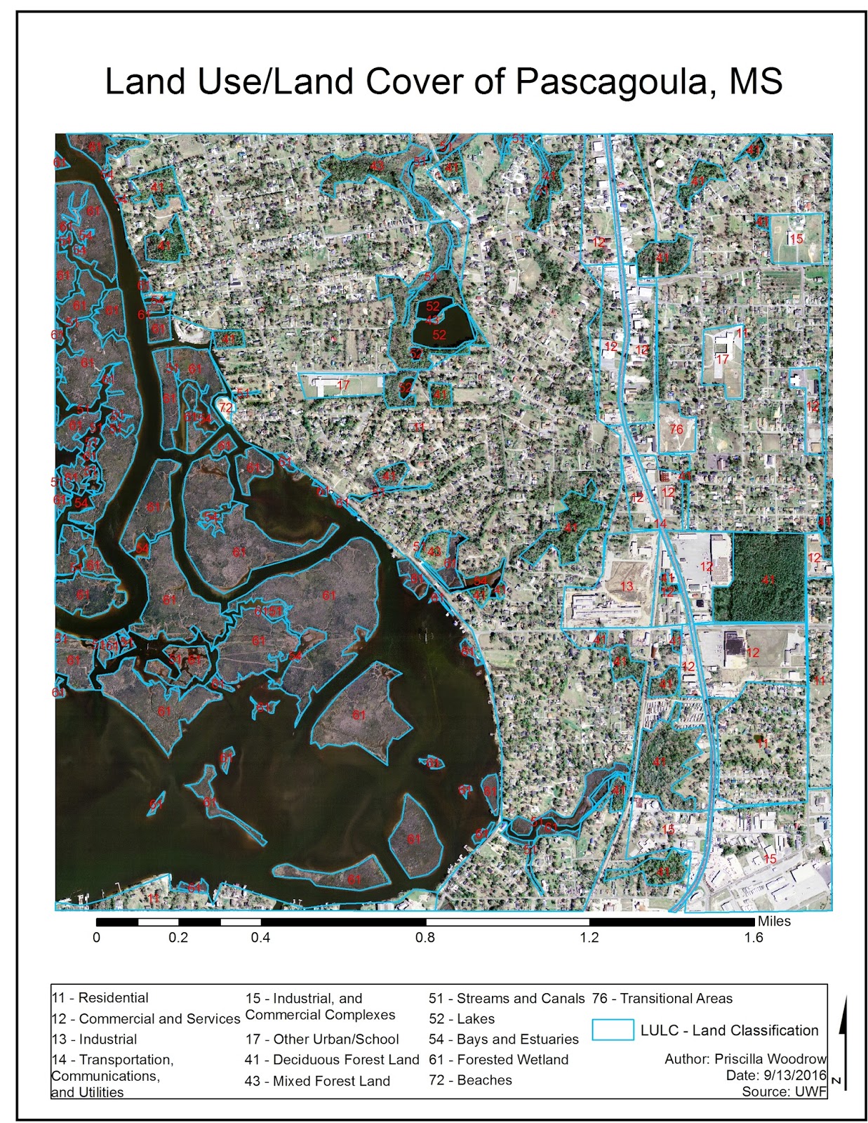
LULC Classification
This week's lab required the classification of land use and land cover of a portion of Pascagoula, MS.
The USGS Level II classification scale was used as a reference in determining how we should classify certain land types.

The USGS Level II classification scale was used as a reference in determining how we should classify certain land types.
Here is my map outcome
Thursday, September 8, 2016
Identifying Mayan Pyramids: Data Preparation
In this week's lab, our main focus was classifying and applying raster imagery to a real world scenario. We will analyze this imagery to identify Mayan pyramids in Mexico.
Below is my map output from this week's lab assignment.

The Landsat raster data was downloaded from USGS Earth Explorer and covers a portion of the Rio Azul National Park in Mexico. The downloaded data came with 9 different (raster) bands, for this lab we worked with Bands 1, 2, 3, 4, and 8.
Band 1 = Blue, Band 2 = Green, Band 3 = Red, Band 4 = Infrared, Band 8 = Panchromatic
Band 8 is panchromatic and has the highest resolution (at 15 m). It appears in black, white, and grey tones. Natural Color is the combination of the Bands 1, 2, and 3. They were combined using the Composite Bands tool in the Image Analysis window of ArcMap. The result is a natural looking color image. False Color is the combination of the Bands 2, 3, and 4, also using the Composite Bands tool. In false color, vegetation appears red because it readily reflects infrared energy.
Monday, September 5, 2016
Module 2 - Aerial Photography Basics & Visual Interpretation of Aerial Photography
In this lab, aerial photographs were examined and analyzed based on tones, textures, and features.
This map shows the varying tones and textures identified in the aerial photograph.

This map shows the varying patterns, shadows, shapes and sizes in the aerial photograph.

Thursday, August 4, 2016
Site Report - Valley of Oaxaca
For my final project, I chose to revisit the Valley of Oaxaca dataset from a previous module assignment. I used the soil and site data from the grids N6E4, N6E5, and N6E6 to test a hypothesis concerning the rise of the Zapotec state. If population pressure was exceeding the regional carrying capacity, we would expect to see phases where the population is much greater than could be supported by agricultural yield estimates in their catchment circles. I completed this analysis with the help of ArcGIS products. Here is a basic outline of steps I created for myself to help with the analysis process.
Methods:
1) Determine time periods to use and make into separate layers.
- 4 time periods total
2) Buffer the sites with a 2 kilometer radius with the Buffer tool.
- Make sure buffers are set to dissolve all.
- 4 buffer outputs total
3) Convert the site polygons into point features using the Feature to Point tool.
- 4 site point feature outputs total
4) Use the site points to create Thiessan Polygons for each time period.
- 3 Thiessan Polygons total
5) Combine the site buffers with the Thiessan Polygon outputs using the Intersect tool.
- 3 intersects total
6) Edit the intersect outputs, snapping the edges of the Thiessan polygon to the buffer and grid boundaries.
- 3 edits total
7) Clip the soil type to the newly edited intersect outputs with the Clip tool.
- 9 clips total
8) Calculate area in hectares of soil clips using the Calculate Geometries function.
9) Perform a spatial join between the clip layers and point file data.
- This combines the population data with the land area data.
Based on these results, I was able to determine if the population
of each site could subsist on the amount of hectares available within their 2
km catchment radius. One adult human can subsist on a
minimum of .5 ha of arable land. For ease of results, 1 ha will equate to
feeding 1 human


The Early I phase
settlement had an estimated population of 185, with 220 ha of Type I land and
1507 ha of Type III all arable land at their disposal. They would require 185
to 370 ha at most in order to sustain their population. Based on the amount of
each land type available to them, they should have been able to support their
population on Type I and Type III all arable land.

The Late I phase has an estimated population of
941, with only 220 ha of Type I land available, 415 ha of Type III 10% arable,
and 1834 ha of Type III all arable land. They would require 941 to 1882
hectares of land at most in order to sustain their population. In terms of yield
productivity, they would not have enough Type I or Type III 10% arable land to
sustain their population. There would be enough Type III all arable land, but
productivity and yields would not be as reliable as Type I land.

The Monte Alban II phase had an estimated
population of 774, with only 220 ha of Type I land and 1579 ha of Type III all
arable land available to them. They would require 774 to 1548 hectares at most
in order to sustain their population. They would not have been able to produce
enough yields with Type I land. They barely meet the requirements for
subsistence on Type III all arable land, which was established as not having
reliable yields.
Wednesday, August 3, 2016
Module 11, Sharing Tools
In this lab, we corrected a few minor parameter errors in a script before successfully embedding the script into the tool for sharing. Below is a screenshot of what the tool's dialog box looks like as well as the outputs of the tool.

Ending notes for the semester:
Out of this whole semester, I
couldn’t pinpoint one single thing as the most interesting, as it was all
(very) new and interesting to me and definitely memorable along the way (as in
major stress, memorable). However, I eventually (and admittedly) enjoyed
leaving my comfort zone with each successful code compilation. That being said, I expect I will use coding (of my own will) in the future.
Wednesday, July 27, 2016
Creating Custom Tools
This week, we created a custom toolbox and modified a script tool to go with it.
Here is what the script tool dialog box looks like.

Here is what the tool dialog window looks like after using .AddMessages() in the script.

Here is a list of the basic steps required to make a custom toolbox and script tool.
1.
Create/modify
a python script.
2.
Create
a custom toolbox.
3.
Add
your script tool to the custom toolbox using Add>Script after right-clicking
toolbox.
4.
Set
the parameters of the tool in the properties to match your script.
5.
Edit
your script if necessary by setting the parameters of the script using
arcpy.GetParameter()
6.
Modify
print statements to arcpy.AddMessage() statements to ensure messages appear in
the geoprocessing environment tool dialog box.
7.
Share
your toolbox, tool, and script by compressing your script and parent toolbox
into a compressed (zip) folder.
Tuesday, July 19, 2016
Working with Rasters
In this week's lab, we worked with rasters and the arcpy.sa module. We were asked to write a code that would reassign values to an assigned raster, as well as reclassify those values to the raster. We created temporary rasters for Slope and Aspect, performed calculation statements from them, and combined the results of those calculations with the reclassified raster to create the raster output below. We created this code all within an if/else statement for checking the Spatial Analyst Extension, as these wont compile unless you have a license for it.
Here is a screenshot of my output raster below:

Here is a flowchart for my script below:

This is the step I had the most difficulty with:
1.
I
had the most difficulty with the Slope and Aspects statements in part f of step
3.
2.
I
kept getting only 0 (in other words, one solid color on my raster) as a result in my output raster, as it would only recognize the
landcover raster.
3.
I
realized I was missing my Aspect variable before the four temporary statements (I
had the Slope variable already made, I guess I overlooked Aspect somehow), also I had to capitalize Slope and Aspect in the variable assignment and the four statements.
Thursday, July 14, 2016
Remote Sensing
For this assignment, we classified the site Monk's Mound, located in Cahokia, Illinois. Cahokia Mounds is the largest prehistoric earthworks north of Mexico and was inhabited from ca. 600-1400 AD. It originally consisted of 120 earthworks, but today is reduced to 80. It is estimated that around 40,000 people may have lived in Cahokia at its peak, yet the reason for it's decline is still unknown. Although there is little known about Cahokia, it is still an important national landmark.
Supervised classification allows you to choose how many classes you use and their general location. I made six classes based off of what I predominantly saw in the Cahokia TIFF image. There is still some slight error in the classification, but I had more control over classification than with unsupervised.

Unsupervised classification automatically classifies areas for you based on the number of classes you desire. This one has eight classes, with almost every single one merging into the class of another (based off toggling back and forth between images). Unsupervised is prone to more error with a fewer number of classes specified.

Wednesday, July 13, 2016
Writing Geometries
In this lab we worked with a river shapefile, set up a search cursor with nested for loops in order to declare some of its geometries, and wrote those geometries to the text using the .write method. Below is a snip of what a portion of the text file result looks like.

Here is the flowchart of the code, with pseudocode below.
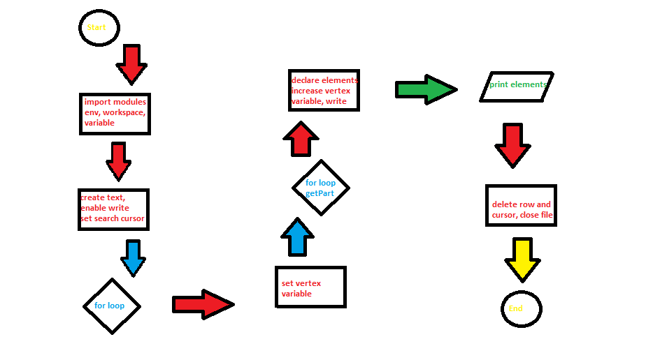
Pseudocode:
StartImport modules
Import env
Set workspace
Set variable
Create text, enable writing
Set SearchCursor array
For loop
Set vertex ID variable to 0
For loop/get.Part method
Element 0 of cursor array declared (feature #)
##Vertex ID printed
Element 1 of cursor array declared (x, y coords)
Element 2 of cursor array declared (name)
Vertex ID variable increased by 1
Write argument declared
Print statement showing all five elements in single line format
Delete row and cursor
Close file
Sunday, July 10, 2016
Peer Review #2
Geoprocessing tool to model beach erosion due to storms: application to Faro beach (Portugal)
By: Almeida, et. al
The authors state that each module was designed with different programming languages (Python and Matlab), but do not explain the reasoning behind this. They do communicate through ArcObjects using VBA. I would like to have known if this is more or less efficient, or if it was the only way to get Kriebel and Dean’s model to run in ArcMap efficiently.
Module 1 and 2 setup and directions are in need of more explanation. While their explanation is ok, it would not hurt to be more specific and detailed for each step the user needs to take to set up and go through the modules. The study scenario was a little unclear in some areas, and I felt like some aspects of the study could have been explained better for those outside of the discipline. Figure six is a good example and helped me better understand the results of the study.
Overall, this application/tool sounds like it is useful and could help out coastal decision-makers prepare for incoming storms. However, the information concerning it is lacking and seems rushed out. I would like to have had more background information about the processes of each module, considering potential users would be most interested in how it works.
http://search.proquest.com.ezproxy.lib.uwf.edu/environmentalscience/docview/1675866765/abstract/9065FD92DC0B493DPQ/40?accountid=14787
Wednesday, July 6, 2016
3D Modeling
In this module's lab, we used ArcScene to create a 3D representation of a shovel test site on the College Lake County Campus in Grayslake, Illinois.
Here is my fly-through animation showing the strata of the shovel test sites.
This image shows the geological layers belonging to each strata. The red-blue scheme is representative of high to low depth.

This image shows the cross section I completed of a proposed cable trench through the study area. The trench runs from the NW to the SE, in a diagonal line.

This is the map I made of the cross section for the proposed cable trench.

This is the map I made for the geological layers and their strata.

Thursday, June 30, 2016
Surface Interpolation
In this lab, our objective was to utilize different types of interpolation methods and to compare and contrast their uses in varying site scenarios.
This was my extra deliverable as a graduate student. This poster shows 5 different maps using varying powers of IDW interpolation. The final map on the bottom right shows the power I felt best portrayed the settlement pattern of prehispanic peoples in coastal Ecuador. This map also uses contouring to highlight the areas with a larger population.

This poster shows the varying density maps I used to portray population density at the Barriles site.

This maps shows the varying density maps I used for the Machalilla site.

Subscribe to:
Comments (Atom)